Sunday, May 15, 2011

Composition Part II - Ignore What I Just Said

Well, not really.

The previous post contains techniques you probably should keep in mind – but more that when you disregard the suggestions, you do so for a reason and/or with panache.


Never in the middle – except...

The case against putting something in the centre falls apart somewhat if the focus is asymmetrical. The more irregular the shape, the less it seems to matter.


Centred, but not dull

If it's a portrait, or some other controlled environment where the background won't add anything to the shot, then having the primary subject(s) off to one edge may make the picture unnecessarily unbalanced.


Might be an idea for a computer desktop picture, but otherwise...

Depending on your camera/lens, the border of a picture may also suffer from distortion (bending of the image), or vignetting (darkening of the image). I almost hesitate to mention this, as it only really happens at the extreme edges.

Most of the Picture?

As with the above, if the subject is interesting enough, you can probably get away with it taking up most of the space.

Conversely, if the background is dull, it's best to be rid as much of it as possible - especially when using a point and shoot camera - as it will likely be almost in focus as well.


There's a few ways you can get these kind of shots to work.

1) Be creative when cropping the shot. People are used to seeing the whole of something. It also helps to remove the (often dull) outer extremities.


You can imagine what the missing elements look like, so including them is superfluous

2) Keep the flash off. Natural light makes things more dynamic. Work with it, not against it.


You won't get shadows like that with the flash on

3) (D)SLR cameras – Selective focus. One of the biggest strengths of these cameras is to have only small portion of your subject showing detail. You keep the colour and shape, but the eye isn't overwhelmed with where to look.


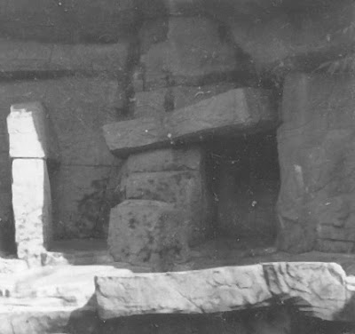
You're drawn to the leading edge - but cropping it to do so would be severe

Tuesday, May 10, 2011

"Out, damn'd spot!" Dust and Scratch Removal

While the words of Lady Macbeth might be taken somewhat out of context, finding out that treasured photographs (slides or film) have been damaged by age, weather and accidents can be pretty infuriating.

Fortunately though, we live in a time where technology can come to the rescue, sortof. Infrared Scanning can remove dust and scratches automatically though only from semi-transparent original media and it's only a feature on rather expensive scanners. Photo Editing programs usually have a 'Dust and Scratch Removal' filter - but often that ends up as too strong, or not strong enough.

That leaves hours and hours of painstaking manual correction -- or does it?

More recent releases of Photoshop have 'Content Aware' repairing, which does a fairly good job of doing, well, exactly what the name implies. Depending on the exact type and extent of the offending marks, this might be simultaneously overkill (the individual damage points aren't very large) and inadequate (the damage is spread out over the entire photo).


Lots of dust, hair and scratches - everywhere.

As is often the case, there is no *single* solution. Nor is something entirely automated the best way to go. At the same time, unless you only have a handful of photos (and really, how often is that?) you want something that doesn't take too long for each image.

After a *lot* of practice I found a method which strikes a rather comfortable and acceptable balance between time/tediousness and final quality.

It assumes a basic knowledge (and quality) of Photo Editing programs - duplicating layers and creating/using masks - as well as being able to adjust filter settings to produce a desired result. If you are confused over any specific step, please leave a comment, or do a Google Brand Search™ for a more detailed explanation. I'm avoiding specifics here because the exact menus and settings vary a lot from program to program.

1) Start by doing a 'Dust/Scratch Removal' at settings that improve the image somewhat but do not affect the image in undamaged areas.

Scratch Removal on lighter settings removes much of the small stuff, but doesn't touch the bigger damage.


2) Duplicate the lightly repaired layer and do 'Dust/Scratch Removal' again, this time with the goal of removing all the imperfections.

Using the more aggressive settings for dust/scratch removal repairs the picture, but also removes a lot of the detail - even in undamaged locations.


3) Mask the 'over-repaired' layer (Hide all) and selectively reveal it in areas where the spots and scratches are visible. Note the white dots in the mask (far right) in the image below.

Best of both worlds.

Composition - A more interesting photograph

It doesn't take much to pick up a camera, point it at something, and push the shutter button. However, if that's all you're doing, it's usually pretty obvious.

Which isn't to say it's an unforgivable thing. Some subjects are outstanding enough on their own that it's difficult to take a dull picture of them. Or it could be more about capturing the moment than making a work of art. Other times, it's more important *who* is in the picture rather than how (subjectively speaking) 'good' it is.

This usually relegates photography almost exclusively to vacations, specific events and pictures of friends and relatives.

That said, even if that's all you want to do, why not make it a bit more than a simple snapshot?*

*Disclaimer: The opinions expressed are mine, and are only that. If you don't like constructive criticism, you might want to stop reading now. Also, the pictures are also mine, so I'm not tearing down anyone else's work (except by implication).


Rules of Thirds - Simplified

If you take a (potential) picture and divide it into thirds horizontally and vertically, the lines segment the picture into nine pieces. The corners of the centre segment, as well as the 4 dividing lines should be where 'points of interest' are in your photograph.

Or, more succinctly - don't centre stuff.

A rather common 'mistake' in most snapshots is to put the subject as the absolute middle of the picture. While it's a rather good way to make sure said focus is in focus, it's the photographic equivalent of clubbing people over the head saying 'This is what you should be looking at'.


Look at me! I'm in the middle! Look at meeeeeeeeeeee!


The solution is rather simple, as most cameras focus when pressing the shutter down half way. Once focused, continue holding the button down (partially!) and change the direction the camera is pointing - even slightly.

A bit further off centre and the image is less harsh.

Room to Breathe


Another slightly grating habit is to have the subject of the photo take up most of the photo. While this may seem a desirable outcome, there's a few reasons why it isn't:

It's a picture of a flower - and not much else.

-
First - from a practical standpoint - it makes it terribly difficult to recompose the picture later when cropping. Facebook profile pictures are square, 4x6 prints are 2:3 (clearly rectangle), and 8x10 photos are 4:5 (wide squarish :p). 'Fill' any of these and you'll likely have problems. As I've mentioned before.
-
Secondly - from an artistic point of view - a picture that's 75% subject tends to be more than a little busy. Negative space is almost as important to a picture as the actual subject - don't skimp. It's also likely violating the 'rule' above and being entirely centred. Last, but certainly not least, it's missing context - where is this in relation to everything else?
-
Thirdly - from a technical perspective - it really isn't necessary. Cameras take in a *lot* of information. If you're interesting in minuscule detail, like individual eyelashes or the exact weave of clothing, then you might want to fill the frame with your subject - macro photography comes to mind. But otherwise don't be afraid to cram a few more things in.

Under relatively ideal conditions a 12MP (DSLR) camera can take a picture of 50 people at once, leave enough room to show what room they're in, put their names at the bottom AND have enough individual detail to make a passable Facebook portrait for each person in the shot.

Unless you're cropping out a lot of your picture later, or printing at 13x19, you'll lose most of that detail anyway.
-


A little context for the image helps it out a lot.

My personal 'rule' is no more than 1/3 of the picture as the main subject. There's exceptions to that, but that's another post....